Payment selection page
The Payment selection page is:
- One of the last steps of the checkout process
- Where a customer can select between one or more payment options (one of them being topi)
- Where a customer may be able to click "Place order" or "Buy now" or, if topi is selected, "Checkout with topi"
Elements for the Payment selection page
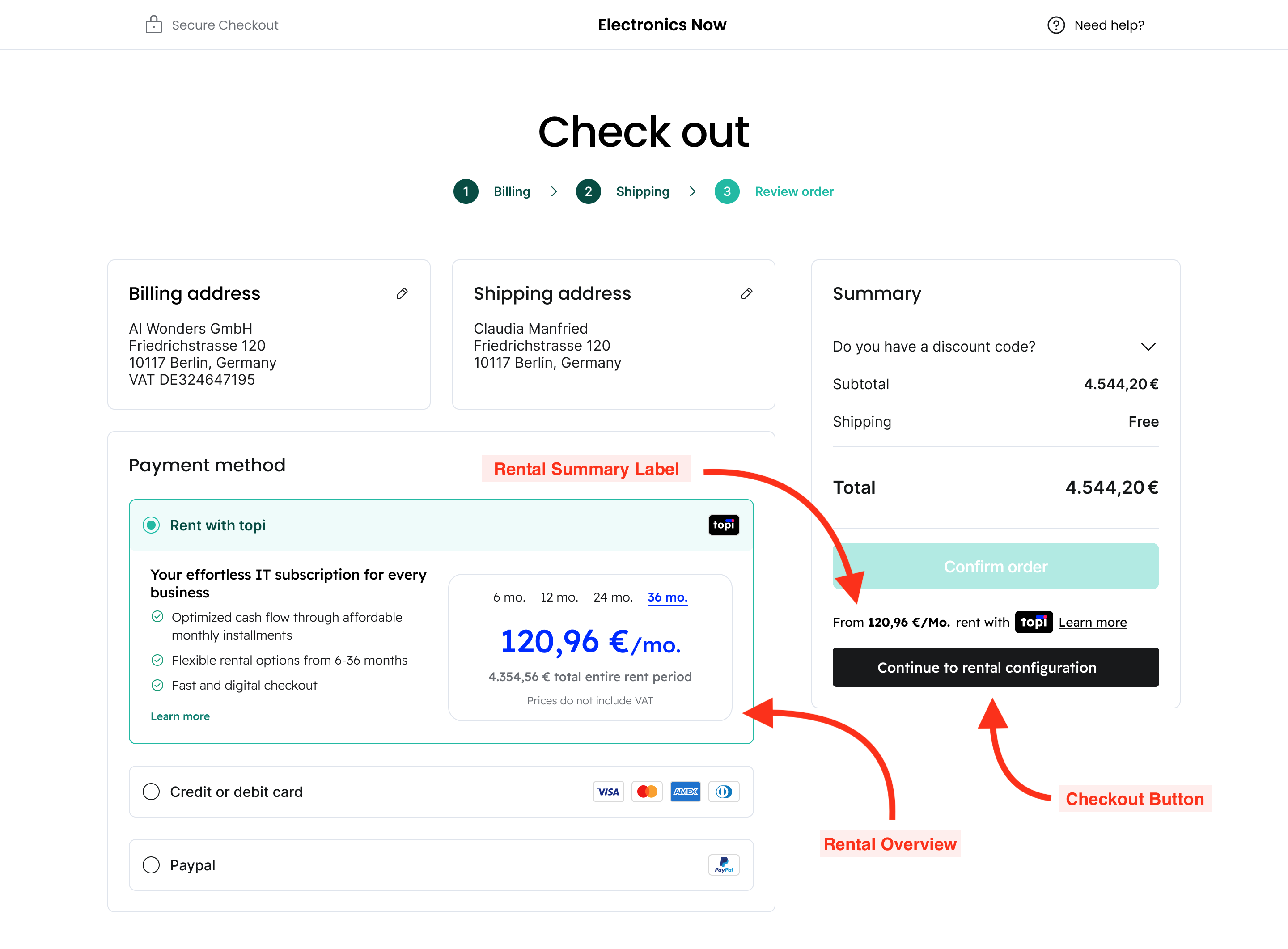
There are 3 topi elements that are relevant here.
The first is the Checkout Button. When clicked, the behaviour should be exactly the same as if it were rendered on the Cart page. That is, the customer should be redirected to the topi hosted checkout.
Second is the Cart Rental Summary Label. This gives an indication to the customer of the combined monthly rental amount based on the cart contents.
Finally, there's the Rental Overview. This element is designed to render inside the Payment Option. It shows the customer what topi offers (rentals) and how much it costs per month to rent everything in their cart through topi.
Render the topi Checkout Button here
Of all the pages where you could place a topi Checkout Button, the Payment selection page is the one we recommend.
This is the page where a customer is considering renting with topi. Together with the Rental Overview element in the payment selection option, it gives the customer the most information about a possible rental. They can toggle between tenures (6, 12, 24, and 36 months) to see how the rental duration affects the monthly and total price.
A topi Checkout Button, rather than a generic "Checkout" button, makes clear what happens next: the customer is taken to the topi hosted checkout to complete their order.